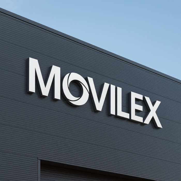
Movilex is a Spanish waste-management company that needed to open up to the European market. The initial brief was a rebrand, but before touching the logo we ran a benchmark of sector brands across Spain and Europe.
That analysis revealed a pattern: the entire sector reaches for the same visual code — green, leaves, nature — as a shortcut to look sustainable. It's a language worn out by overuse, and it wasn't helping Movilex compete in a wider, more demanding market. So we proposed breaking with it: replacing green with blue, moving the brand away from the sector's usual greenwashing and towards a broader, more contemporary positioning, consistent with its ambition to grow beyond Spain.
The proposal didn't stop at a colour change — it meant rethinking how the entire sector presents itself, and it was exactly that approach that convinced the CEO.
From there we developed a complete brand system: a new minimalist logotype, colour palette, iconography and photography direction, documented in a 113-page brandbook together with two sales dossiers. The system was applied across every real touchpoint of the operation — truck livery, uniforms, factories, offices and digital materials — implemented alongside the company's in-house team.
Brand voice and narrative was developed by a verbal-branding specialist; all visual development, start to finish, was our own responsibility.